#include <vtkKWPushButton.h>
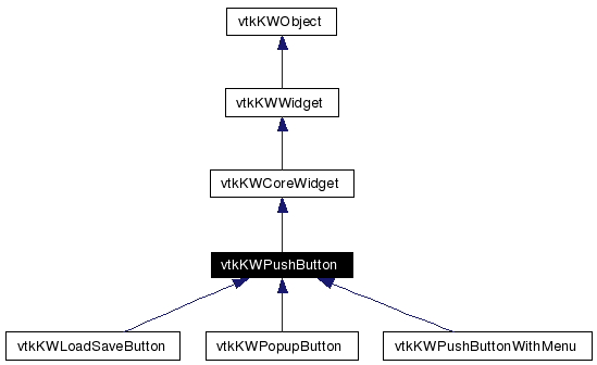
Inheritance diagram for vtkKWPushButton:
Public Member Functions | |
| vtkTypeRevisionMacro (vtkKWPushButton, vtkKWCoreWidget) | |
| void | PrintSelf (ostream &os, vtkIndent indent) |
| virtual void | Create (vtkKWApplication *app) |
| virtual void | SetCommand (vtkObject *object, const char *method) |
| virtual void | UpdateEnableState () |
| virtual void | SetText (const char *label) |
| virtual char * | GetText () |
| virtual void | SetWidth (int width) |
| virtual int | GetWidth () |
| virtual void | SetHeight (int height) |
| virtual int | GetHeight () |
| virtual void | SetAnchor (int) |
| virtual int | GetAnchor () |
| virtual void | SetAnchorToNorth () |
| virtual void | SetAnchorToNorthEast () |
| virtual void | SetAnchorToEast () |
| virtual void | SetAnchorToSouthEast () |
| virtual void | SetAnchorToSouth () |
| virtual void | SetAnchorToSouthWest () |
| virtual void | SetAnchorToWest () |
| virtual void | SetAnchorToNorthWest () |
| virtual void | SetAnchorToCenter () |
| virtual void | SetOverRelief (int) |
| virtual int | GetOverRelief () |
| virtual void | SetOverReliefToRaised () |
| virtual void | SetOverReliefToSunken () |
| virtual void | SetOverReliefToFlat () |
| virtual void | SetOverReliefToRidge () |
| virtual void | SetOverReliefToSolid () |
| virtual void | SetOverReliefToGroove () |
| virtual void | SetOverReliefToNone () |
| virtual void | SetImageToIcon (vtkKWIcon *icon) |
| virtual void | SetImageToPredefinedIcon (int icon_index) |
| virtual void | SetImageToPixels (const unsigned char *pixels, int width, int height, int pixel_size, unsigned long buffer_length=0) |
Static Public Member Functions | |
| vtkKWPushButton * | New () |
Protected Member Functions | |
| vtkKWPushButton () | |
| ~vtkKWPushButton () | |
| virtual void | SetButtonText (const char *) |
Protected Attributes | |
| char * | ButtonText |
A simple widget that represents a push button.
Definition at line 27 of file vtkKWPushButton.h.
|
|
|
|
|
|
|
|
Reimplemented from vtkKWCoreWidget. Reimplemented in vtkKWLoadSaveButton, vtkKWPopupButton, and vtkKWPushButtonWithMenu. |
|
||||||||||||
|
|
|
||||||||||||
|
Reimplemented from vtkKWCoreWidget. Reimplemented in vtkKWLoadSaveButton, vtkKWPopupButton, and vtkKWPushButtonWithMenu. |
|
|
Create the widget. Reimplemented from vtkKWCoreWidget. Reimplemented in vtkKWLoadSaveButton, vtkKWPopupButton, and vtkKWPushButtonWithMenu. |
|
|
Convenience method to set the contents label. |
|
|
Convenience method to set the contents label. |
|
|
Convenience method to set/get the text width (in chars if the button has a text contents, or pixels if it has an image contents). |
|
|
Convenience method to set/get the text width (in chars if the button has a text contents, or pixels if it has an image contents). |
|
|
Convenience method to set/get the text height (in chars if the button has a text contents, or pixels if it has an image contents). |
|
|
Convenience method to set/get the text height (in chars if the button has a text contents, or pixels if it has an image contents). |
|
||||||||||||
|
Specifies a command to associate with the widget. This command is typically invoked when mouse button 1 is released over the button. The first argument is the object that will have the method called on it. The second argument is the name of the method to be called and any arguments in string form. If the object is NULL, the method is evaluated as a simple command. Reimplemented in vtkKWLoadSaveButton. |
|
|
Set/Get the anchoring. Specifies how the information in a widget (e.g. text or a bitmap) is to be displayed in the widget. Valid constants can be found in vtkKWTkOptions::AnchorType. |
|
|
Set/Get the anchoring. Specifies how the information in a widget (e.g. text or a bitmap) is to be displayed in the widget. Valid constants can be found in vtkKWTkOptions::AnchorType. |
|
|
Set/Get the anchoring. Specifies how the information in a widget (e.g. text or a bitmap) is to be displayed in the widget. Valid constants can be found in vtkKWTkOptions::AnchorType. Definition at line 71 of file vtkKWPushButton.h. |
|
|
Set/Get the anchoring. Specifies how the information in a widget (e.g. text or a bitmap) is to be displayed in the widget. Valid constants can be found in vtkKWTkOptions::AnchorType. Definition at line 73 of file vtkKWPushButton.h. |
|
|
Set/Get the anchoring. Specifies how the information in a widget (e.g. text or a bitmap) is to be displayed in the widget. Valid constants can be found in vtkKWTkOptions::AnchorType. Definition at line 75 of file vtkKWPushButton.h. |
|
|
Set/Get the anchoring. Specifies how the information in a widget (e.g. text or a bitmap) is to be displayed in the widget. Valid constants can be found in vtkKWTkOptions::AnchorType. Definition at line 77 of file vtkKWPushButton.h. |
|
|
Set/Get the anchoring. Specifies how the information in a widget (e.g. text or a bitmap) is to be displayed in the widget. Valid constants can be found in vtkKWTkOptions::AnchorType. Definition at line 79 of file vtkKWPushButton.h. |
|
|
Set/Get the anchoring. Specifies how the information in a widget (e.g. text or a bitmap) is to be displayed in the widget. Valid constants can be found in vtkKWTkOptions::AnchorType. Definition at line 81 of file vtkKWPushButton.h. |
|
|
Set/Get the anchoring. Specifies how the information in a widget (e.g. text or a bitmap) is to be displayed in the widget. Valid constants can be found in vtkKWTkOptions::AnchorType. Definition at line 83 of file vtkKWPushButton.h. |
|
|
Set/Get the anchoring. Specifies how the information in a widget (e.g. text or a bitmap) is to be displayed in the widget. Valid constants can be found in vtkKWTkOptions::AnchorType. Definition at line 85 of file vtkKWPushButton.h. |
|
|
Set/Get the anchoring. Specifies how the information in a widget (e.g. text or a bitmap) is to be displayed in the widget. Valid constants can be found in vtkKWTkOptions::AnchorType. Definition at line 87 of file vtkKWPushButton.h. |
|
|
Set/Get the 3-D effect desired for the widget. Specifies an alternative relief for the button, to be used when the mouse cursor is over the widget. This option can be used to make toolbar buttons, by configuring SetRelief to Flat and OverRelief to Raised. Valid constants can be found in vtkKWTkOptions::ReliefType. If the value of this option is None, then no alternative relief is used when the mouse cursor is over the checkbutton. |
|
|
Set/Get the 3-D effect desired for the widget. Specifies an alternative relief for the button, to be used when the mouse cursor is over the widget. This option can be used to make toolbar buttons, by configuring SetRelief to Flat and OverRelief to Raised. Valid constants can be found in vtkKWTkOptions::ReliefType. If the value of this option is None, then no alternative relief is used when the mouse cursor is over the checkbutton. Definition at line 101 of file vtkKWPushButton.h. |
|
|
Set/Get the 3-D effect desired for the widget. Specifies an alternative relief for the button, to be used when the mouse cursor is over the widget. This option can be used to make toolbar buttons, by configuring SetRelief to Flat and OverRelief to Raised. Valid constants can be found in vtkKWTkOptions::ReliefType. If the value of this option is None, then no alternative relief is used when the mouse cursor is over the checkbutton. Definition at line 103 of file vtkKWPushButton.h. |
|
|
Set/Get the 3-D effect desired for the widget. Specifies an alternative relief for the button, to be used when the mouse cursor is over the widget. This option can be used to make toolbar buttons, by configuring SetRelief to Flat and OverRelief to Raised. Valid constants can be found in vtkKWTkOptions::ReliefType. If the value of this option is None, then no alternative relief is used when the mouse cursor is over the checkbutton. Definition at line 105 of file vtkKWPushButton.h. |
|
|
Set/Get the 3-D effect desired for the widget. Specifies an alternative relief for the button, to be used when the mouse cursor is over the widget. This option can be used to make toolbar buttons, by configuring SetRelief to Flat and OverRelief to Raised. Valid constants can be found in vtkKWTkOptions::ReliefType. If the value of this option is None, then no alternative relief is used when the mouse cursor is over the checkbutton. Definition at line 107 of file vtkKWPushButton.h. |
|
|
Set/Get the 3-D effect desired for the widget. Specifies an alternative relief for the button, to be used when the mouse cursor is over the widget. This option can be used to make toolbar buttons, by configuring SetRelief to Flat and OverRelief to Raised. Valid constants can be found in vtkKWTkOptions::ReliefType. If the value of this option is None, then no alternative relief is used when the mouse cursor is over the checkbutton. Definition at line 109 of file vtkKWPushButton.h. |
|
|
Set/Get the 3-D effect desired for the widget. Specifies an alternative relief for the button, to be used when the mouse cursor is over the widget. This option can be used to make toolbar buttons, by configuring SetRelief to Flat and OverRelief to Raised. Valid constants can be found in vtkKWTkOptions::ReliefType. If the value of this option is None, then no alternative relief is used when the mouse cursor is over the checkbutton. Definition at line 111 of file vtkKWPushButton.h. |
|
|
Set/Get the 3-D effect desired for the widget. Specifies an alternative relief for the button, to be used when the mouse cursor is over the widget. This option can be used to make toolbar buttons, by configuring SetRelief to Flat and OverRelief to Raised. Valid constants can be found in vtkKWTkOptions::ReliefType. If the value of this option is None, then no alternative relief is used when the mouse cursor is over the checkbutton. Definition at line 113 of file vtkKWPushButton.h. |
|
|
Specifies an image to display in the widget. Typically, if the image is specified then it overrides other options that specify a bitmap or textual value to display in the widget. Invoke vtkKWWidget's SetConfigurationOption("-image", imagename) to use a specific pre-existing Tk image, or call one of the following functions. The SetImageToPredefinedIcon method accepts an index to one of the predefined icon listed in vtkKWIcon. The SetImageToPixels method sets the image using pixel data. It expects a pointer to the pixels and the structure of the image, i.e. its width, height and the pixel_size (how many bytes per pixel, say 3 for RGB, or 1 for grayscale). If buffer_length = 0, it is computed automatically from the previous parameters. If it is not, it will most likely indicate that the buffer has been encoded using base64 and/or zlib. If pixel_size > 3 (i.e. RGBA), the image is blend the with background color of the widget. |
|
|
Specifies an image to display in the widget. Typically, if the image is specified then it overrides other options that specify a bitmap or textual value to display in the widget. Invoke vtkKWWidget's SetConfigurationOption("-image", imagename) to use a specific pre-existing Tk image, or call one of the following functions. The SetImageToPredefinedIcon method accepts an index to one of the predefined icon listed in vtkKWIcon. The SetImageToPixels method sets the image using pixel data. It expects a pointer to the pixels and the structure of the image, i.e. its width, height and the pixel_size (how many bytes per pixel, say 3 for RGB, or 1 for grayscale). If buffer_length = 0, it is computed automatically from the previous parameters. If it is not, it will most likely indicate that the buffer has been encoded using base64 and/or zlib. If pixel_size > 3 (i.e. RGBA), the image is blend the with background color of the widget. |
|
||||||||||||||||||||||||
|
Specifies an image to display in the widget. Typically, if the image is specified then it overrides other options that specify a bitmap or textual value to display in the widget. Invoke vtkKWWidget's SetConfigurationOption("-image", imagename) to use a specific pre-existing Tk image, or call one of the following functions. The SetImageToPredefinedIcon method accepts an index to one of the predefined icon listed in vtkKWIcon. The SetImageToPixels method sets the image using pixel data. It expects a pointer to the pixels and the structure of the image, i.e. its width, height and the pixel_size (how many bytes per pixel, say 3 for RGB, or 1 for grayscale). If buffer_length = 0, it is computed automatically from the previous parameters. If it is not, it will most likely indicate that the buffer has been encoded using base64 and/or zlib. If pixel_size > 3 (i.e. RGBA), the image is blend the with background color of the widget. |
|
|
Update the "enable" state of the object and its internal parts. Depending on different Ivars (this->Enabled, the application's Limited Edition Mode, etc.), the "enable" state of the object is updated and propagated to its internal parts/subwidgets. This will, for example, enable/disable parts of the widget UI, enable/disable the visibility of 3D widgets, etc. Reimplemented from vtkKWWidget. Reimplemented in vtkKWLoadSaveButton, vtkKWPopupButton, and vtkKWPushButtonWithMenu. |
|
|
|
|
|
Definition at line 153 of file vtkKWPushButton.h. |
 1.3.5
1.3.5