#include <vtkKWCheckButton.h>
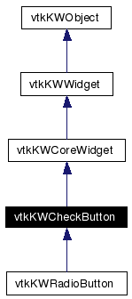
Inheritance diagram for vtkKWCheckButton:
Public Member Functions | |
| vtkTypeRevisionMacro (vtkKWCheckButton, vtkKWCoreWidget) | |
| void | PrintSelf (ostream &os, vtkIndent indent) |
| virtual void | Create (vtkKWApplication *app) |
| virtual void | SetCommand (vtkObject *object, const char *method) |
| virtual void | UpdateEnableState () |
| virtual void | SetSelectedState (int) |
| virtual int | GetSelectedState () |
| virtual void | SelectedStateOn () |
| virtual void | SelectedStateOff () |
| virtual void | ToggleSelectedState () |
| virtual void | Select () |
| virtual void | DeSelect () |
| virtual void | SetIndicatorVisibility (int ind) |
| virtual int | GetIndicatorVisibility () |
| virtual void | IndicatorVisibilityOn () |
| virtual void | IndicatorVisibilityOff () |
| virtual void | SetText (const char *txt) |
| virtual const char * | GetText () |
| virtual char * | GetVariableName () |
| virtual void | SetVariableName (const char *) |
| virtual void | SetAnchor (int) |
| virtual int | GetAnchor () |
| virtual void | SetAnchorToNorth () |
| virtual void | SetAnchorToNorthEast () |
| virtual void | SetAnchorToEast () |
| virtual void | SetAnchorToSouthEast () |
| virtual void | SetAnchorToSouth () |
| virtual void | SetAnchorToSouthWest () |
| virtual void | SetAnchorToWest () |
| virtual void | SetAnchorToNorthWest () |
| virtual void | SetAnchorToCenter () |
| virtual void | SetOffRelief (int) |
| virtual int | GetOffRelief () |
| virtual void | SetOffReliefToRaised () |
| virtual void | SetOffReliefToSunken () |
| virtual void | SetOffReliefToFlat () |
| virtual void | SetOffReliefToRidge () |
| virtual void | SetOffReliefToSolid () |
| virtual void | SetOffReliefToGroove () |
| virtual void | SetOverRelief (int) |
| virtual int | GetOverRelief () |
| virtual void | SetOverReliefToRaised () |
| virtual void | SetOverReliefToSunken () |
| virtual void | SetOverReliefToFlat () |
| virtual void | SetOverReliefToRidge () |
| virtual void | SetOverReliefToSolid () |
| virtual void | SetOverReliefToGroove () |
| virtual void | SetOverReliefToNone () |
| virtual void | SetImageToIcon (vtkKWIcon *icon) |
| virtual void | SetImageToPredefinedIcon (int icon_index) |
| virtual void | SetImageToPixels (const unsigned char *pixels, int width, int height, int pixel_size, unsigned long buffer_length=0) |
Static Public Member Functions | |
| vtkKWCheckButton * | New () |
Protected Member Functions | |
| virtual void | SetMyText (const char *) |
| vtkKWCheckButton () | |
| ~vtkKWCheckButton () | |
| void | Configure () |
Protected Attributes | |
| int | IndicatorVisibility |
| char * | MyText |
| char * | VariableName |
A simple widget that represents a check button. It can be modified and queried using the GetSelectedState and SetSelectedState methods.
Definition at line 28 of file vtkKWCheckButton.h.
|
|
|
|
|
|
|
|
Reimplemented from vtkKWCoreWidget. Reimplemented in vtkKWRadioButton. |
|
||||||||||||
|
|
|
||||||||||||
|
Reimplemented from vtkKWCoreWidget. Reimplemented in vtkKWRadioButton. |
|
|
Create the widget. Reimplemented from vtkKWCoreWidget. Reimplemented in vtkKWRadioButton. |
|
|
Set/Get/Toggle the state of the check button 0 = off 1 = on |
|
|
Set/Get/Toggle the state of the check button 0 = off 1 = on Reimplemented in vtkKWRadioButton. |
|
|
Set/Get/Toggle the state of the check button 0 = off 1 = on Reimplemented in vtkKWRadioButton. |
|
|
Set/Get/Toggle the state of the check button 0 = off 1 = on Reimplemented in vtkKWRadioButton. |
|
|
Set/Get/Toggle the state of the check button 0 = off 1 = on |
|
|
Set/Get/Toggle the state of the check button 0 = off 1 = on Definition at line 44 of file vtkKWCheckButton.h. |
|
|
Set/Get/Toggle the state of the check button 0 = off 1 = on Definition at line 45 of file vtkKWCheckButton.h. |
|
|
Tell the widget whether it should use an indicator (check box) |
|
|
Tell the widget whether it should use an indicator (check box) |
|
|
Tell the widget whether it should use an indicator (check box) |
|
|
Tell the widget whether it should use an indicator (check box) |
|
|
Set the text. |
|
|
Set the text. |
|
|
Set the variable name. |
|
|
Set the variable name. |
|
||||||||||||
|
Specifies a command to associate with the widget. This command is typically invoked when mouse button 1 is released over the button. The first argument is the object that will have the method called on it. The second argument is the name of the method to be called and any arguments in string form. If the object is NULL, the method is evaluated as a simple command. |
|
|
Set/Get the anchoring. Specifies how the information in a widget (e.g. text or a bitmap) is to be displayed in the widget. Valid constants can be found in vtkKWTkOptions::AnchorType. |
|
|
Set/Get the anchoring. Specifies how the information in a widget (e.g. text or a bitmap) is to be displayed in the widget. Valid constants can be found in vtkKWTkOptions::AnchorType. |
|
|
Set/Get the anchoring. Specifies how the information in a widget (e.g. text or a bitmap) is to be displayed in the widget. Valid constants can be found in vtkKWTkOptions::AnchorType. Definition at line 81 of file vtkKWCheckButton.h. |
|
|
Set/Get the anchoring. Specifies how the information in a widget (e.g. text or a bitmap) is to be displayed in the widget. Valid constants can be found in vtkKWTkOptions::AnchorType. Definition at line 83 of file vtkKWCheckButton.h. |
|
|
Set/Get the anchoring. Specifies how the information in a widget (e.g. text or a bitmap) is to be displayed in the widget. Valid constants can be found in vtkKWTkOptions::AnchorType. Definition at line 85 of file vtkKWCheckButton.h. |
|
|
Set/Get the anchoring. Specifies how the information in a widget (e.g. text or a bitmap) is to be displayed in the widget. Valid constants can be found in vtkKWTkOptions::AnchorType. Definition at line 87 of file vtkKWCheckButton.h. |
|
|
Set/Get the anchoring. Specifies how the information in a widget (e.g. text or a bitmap) is to be displayed in the widget. Valid constants can be found in vtkKWTkOptions::AnchorType. Definition at line 89 of file vtkKWCheckButton.h. |
|
|
Set/Get the anchoring. Specifies how the information in a widget (e.g. text or a bitmap) is to be displayed in the widget. Valid constants can be found in vtkKWTkOptions::AnchorType. Definition at line 91 of file vtkKWCheckButton.h. |
|
|
Set/Get the anchoring. Specifies how the information in a widget (e.g. text or a bitmap) is to be displayed in the widget. Valid constants can be found in vtkKWTkOptions::AnchorType. Definition at line 93 of file vtkKWCheckButton.h. |
|
|
Set/Get the anchoring. Specifies how the information in a widget (e.g. text or a bitmap) is to be displayed in the widget. Valid constants can be found in vtkKWTkOptions::AnchorType. Definition at line 95 of file vtkKWCheckButton.h. |
|
|
Set/Get the anchoring. Specifies how the information in a widget (e.g. text or a bitmap) is to be displayed in the widget. Valid constants can be found in vtkKWTkOptions::AnchorType. Definition at line 97 of file vtkKWCheckButton.h. |
|
|
Set/Get the 3-D effect desired for the widget. Specifies the relief for the button when the indicator is not drawn (i.e. IndicatorVisibility is Off) and the button is not selected. The default value is Raised. By setting this option to Flat and setting IndicatorVisibility to Off and OverRelief to Raised or Flat, the effect is achieved of having a flat button that raises on mouse-over and which is depressed when activated. This is the behavior typically exhibited by the Bold, Italic, and Underline checkbuttons on the toolbar of a word-processor, for example. Valid constants can be found in vtkKWTkOptions::ReliefType. |
|
|
Set/Get the 3-D effect desired for the widget. Specifies the relief for the button when the indicator is not drawn (i.e. IndicatorVisibility is Off) and the button is not selected. The default value is Raised. By setting this option to Flat and setting IndicatorVisibility to Off and OverRelief to Raised or Flat, the effect is achieved of having a flat button that raises on mouse-over and which is depressed when activated. This is the behavior typically exhibited by the Bold, Italic, and Underline checkbuttons on the toolbar of a word-processor, for example. Valid constants can be found in vtkKWTkOptions::ReliefType. Definition at line 114 of file vtkKWCheckButton.h. |
|
|
Set/Get the 3-D effect desired for the widget. Specifies the relief for the button when the indicator is not drawn (i.e. IndicatorVisibility is Off) and the button is not selected. The default value is Raised. By setting this option to Flat and setting IndicatorVisibility to Off and OverRelief to Raised or Flat, the effect is achieved of having a flat button that raises on mouse-over and which is depressed when activated. This is the behavior typically exhibited by the Bold, Italic, and Underline checkbuttons on the toolbar of a word-processor, for example. Valid constants can be found in vtkKWTkOptions::ReliefType. Definition at line 116 of file vtkKWCheckButton.h. |
|
|
Set/Get the 3-D effect desired for the widget. Specifies the relief for the button when the indicator is not drawn (i.e. IndicatorVisibility is Off) and the button is not selected. The default value is Raised. By setting this option to Flat and setting IndicatorVisibility to Off and OverRelief to Raised or Flat, the effect is achieved of having a flat button that raises on mouse-over and which is depressed when activated. This is the behavior typically exhibited by the Bold, Italic, and Underline checkbuttons on the toolbar of a word-processor, for example. Valid constants can be found in vtkKWTkOptions::ReliefType. Definition at line 118 of file vtkKWCheckButton.h. |
|
|
Set/Get the 3-D effect desired for the widget. Specifies the relief for the button when the indicator is not drawn (i.e. IndicatorVisibility is Off) and the button is not selected. The default value is Raised. By setting this option to Flat and setting IndicatorVisibility to Off and OverRelief to Raised or Flat, the effect is achieved of having a flat button that raises on mouse-over and which is depressed when activated. This is the behavior typically exhibited by the Bold, Italic, and Underline checkbuttons on the toolbar of a word-processor, for example. Valid constants can be found in vtkKWTkOptions::ReliefType. Definition at line 120 of file vtkKWCheckButton.h. |
|
|
Set/Get the 3-D effect desired for the widget. Specifies the relief for the button when the indicator is not drawn (i.e. IndicatorVisibility is Off) and the button is not selected. The default value is Raised. By setting this option to Flat and setting IndicatorVisibility to Off and OverRelief to Raised or Flat, the effect is achieved of having a flat button that raises on mouse-over and which is depressed when activated. This is the behavior typically exhibited by the Bold, Italic, and Underline checkbuttons on the toolbar of a word-processor, for example. Valid constants can be found in vtkKWTkOptions::ReliefType. Definition at line 122 of file vtkKWCheckButton.h. |
|
|
Set/Get the 3-D effect desired for the widget. Specifies the relief for the button when the indicator is not drawn (i.e. IndicatorVisibility is Off) and the button is not selected. The default value is Raised. By setting this option to Flat and setting IndicatorVisibility to Off and OverRelief to Raised or Flat, the effect is achieved of having a flat button that raises on mouse-over and which is depressed when activated. This is the behavior typically exhibited by the Bold, Italic, and Underline checkbuttons on the toolbar of a word-processor, for example. Valid constants can be found in vtkKWTkOptions::ReliefType. Definition at line 124 of file vtkKWCheckButton.h. |
|
|
Set/Get the 3-D effect desired for the widget. Specifies an alternative relief for the button, to be used when the mouse cursor is over the widget. This option can be used to make toolbar buttons, by configuring SetRelief to Flat and OverRelief to Raised. Valid constants can be found in vtkKWTkOptions::ReliefType. If the value of this option is None, then no alternative relief is used when the mouse cursor is over the checkbutton. |
|
|
Set/Get the 3-D effect desired for the widget. Specifies an alternative relief for the button, to be used when the mouse cursor is over the widget. This option can be used to make toolbar buttons, by configuring SetRelief to Flat and OverRelief to Raised. Valid constants can be found in vtkKWTkOptions::ReliefType. If the value of this option is None, then no alternative relief is used when the mouse cursor is over the checkbutton. Definition at line 138 of file vtkKWCheckButton.h. |
|
|
Set/Get the 3-D effect desired for the widget. Specifies an alternative relief for the button, to be used when the mouse cursor is over the widget. This option can be used to make toolbar buttons, by configuring SetRelief to Flat and OverRelief to Raised. Valid constants can be found in vtkKWTkOptions::ReliefType. If the value of this option is None, then no alternative relief is used when the mouse cursor is over the checkbutton. Definition at line 140 of file vtkKWCheckButton.h. |
|
|
Set/Get the 3-D effect desired for the widget. Specifies an alternative relief for the button, to be used when the mouse cursor is over the widget. This option can be used to make toolbar buttons, by configuring SetRelief to Flat and OverRelief to Raised. Valid constants can be found in vtkKWTkOptions::ReliefType. If the value of this option is None, then no alternative relief is used when the mouse cursor is over the checkbutton. Definition at line 142 of file vtkKWCheckButton.h. |
|
|
Set/Get the 3-D effect desired for the widget. Specifies an alternative relief for the button, to be used when the mouse cursor is over the widget. This option can be used to make toolbar buttons, by configuring SetRelief to Flat and OverRelief to Raised. Valid constants can be found in vtkKWTkOptions::ReliefType. If the value of this option is None, then no alternative relief is used when the mouse cursor is over the checkbutton. Definition at line 144 of file vtkKWCheckButton.h. |
|
|
Set/Get the 3-D effect desired for the widget. Specifies an alternative relief for the button, to be used when the mouse cursor is over the widget. This option can be used to make toolbar buttons, by configuring SetRelief to Flat and OverRelief to Raised. Valid constants can be found in vtkKWTkOptions::ReliefType. If the value of this option is None, then no alternative relief is used when the mouse cursor is over the checkbutton. Definition at line 146 of file vtkKWCheckButton.h. |
|
|
Set/Get the 3-D effect desired for the widget. Specifies an alternative relief for the button, to be used when the mouse cursor is over the widget. This option can be used to make toolbar buttons, by configuring SetRelief to Flat and OverRelief to Raised. Valid constants can be found in vtkKWTkOptions::ReliefType. If the value of this option is None, then no alternative relief is used when the mouse cursor is over the checkbutton. Definition at line 148 of file vtkKWCheckButton.h. |
|
|
Set/Get the 3-D effect desired for the widget. Specifies an alternative relief for the button, to be used when the mouse cursor is over the widget. This option can be used to make toolbar buttons, by configuring SetRelief to Flat and OverRelief to Raised. Valid constants can be found in vtkKWTkOptions::ReliefType. If the value of this option is None, then no alternative relief is used when the mouse cursor is over the checkbutton. Definition at line 150 of file vtkKWCheckButton.h. |
|
|
Specifies an image to display in the widget. Typically, if the image is specified then it overrides other options that specify a bitmap or textual value to display in the widget. Invoke vtkKWWidget's SetConfigurationOption("-image", imagename) to use a specific pre-existing Tk image, or call one of the following functions. The SetImageToPredefinedIcon method accepts an index to one of the predefined icon listed in vtkKWIcon. The SetImageToPixels method sets the image using pixel data. It expects a pointer to the pixels and the structure of the image, i.e. its width, height and the pixel_size (how many bytes per pixel, say 3 for RGB, or 1 for grayscale). If buffer_length = 0, it is computed automatically from the previous parameters. If it is not, it will most likely indicate that the buffer has been encoded using base64 and/or zlib. If pixel_size > 3 (i.e. RGBA), the image is blend the with background color of the widget. |
|
|
Specifies an image to display in the widget. Typically, if the image is specified then it overrides other options that specify a bitmap or textual value to display in the widget. Invoke vtkKWWidget's SetConfigurationOption("-image", imagename) to use a specific pre-existing Tk image, or call one of the following functions. The SetImageToPredefinedIcon method accepts an index to one of the predefined icon listed in vtkKWIcon. The SetImageToPixels method sets the image using pixel data. It expects a pointer to the pixels and the structure of the image, i.e. its width, height and the pixel_size (how many bytes per pixel, say 3 for RGB, or 1 for grayscale). If buffer_length = 0, it is computed automatically from the previous parameters. If it is not, it will most likely indicate that the buffer has been encoded using base64 and/or zlib. If pixel_size > 3 (i.e. RGBA), the image is blend the with background color of the widget. |
|
||||||||||||||||||||||||
|
Specifies an image to display in the widget. Typically, if the image is specified then it overrides other options that specify a bitmap or textual value to display in the widget. Invoke vtkKWWidget's SetConfigurationOption("-image", imagename) to use a specific pre-existing Tk image, or call one of the following functions. The SetImageToPredefinedIcon method accepts an index to one of the predefined icon listed in vtkKWIcon. The SetImageToPixels method sets the image using pixel data. It expects a pointer to the pixels and the structure of the image, i.e. its width, height and the pixel_size (how many bytes per pixel, say 3 for RGB, or 1 for grayscale). If buffer_length = 0, it is computed automatically from the previous parameters. If it is not, it will most likely indicate that the buffer has been encoded using base64 and/or zlib. If pixel_size > 3 (i.e. RGBA), the image is blend the with background color of the widget. |
|
|
Update the "enable" state of the object and its internal parts. Depending on different Ivars (this->Enabled, the application's Limited Edition Mode, etc.), the "enable" state of the object is updated and propagated to its internal parts/subwidgets. This will, for example, enable/disable parts of the widget UI, enable/disable the visibility of 3D widgets, etc. Reimplemented from vtkKWWidget. |
|
|
|
|
|
|
|
|
Definition at line 192 of file vtkKWCheckButton.h. |
|
|
Definition at line 193 of file vtkKWCheckButton.h. |
|
|
Definition at line 194 of file vtkKWCheckButton.h. |
 1.3.5
1.3.5